Using colors, visuals, gestures, and stories to support comprehension and communication
WHY RED & BLUE?
If you’ve followed my classroom for a while, you’ve probably seen these cards before. They’ve become a big part of the way I teach through stories.

They’re always close by when we’re reading a story, having a conversation, or interacting in Spanish. But they’re not on my wall just to make the classroom look nice.
The colors, illustrations, gestures, and even the way I add the words to the wall all have a purpose: to give my young and novice learners multiple ways to understand the language and eventually use it to communicate.
And most importantly, these words don’t just live on the wall. I intentionally recycle them again and again throughout our stories.
Where did the idea start?
The color distinction itself wasn’t my idea.
I first saw it at a conference, where teachers were using markers to write high-frequency words and underline the English meaning.
I loved the idea and immediately started thinking about how I could adapt it for my young learners.
I wanted something I could reuse instead of writing the words every time. And because I teach young children, I also wanted to provide more support than just a written word and its English translation.
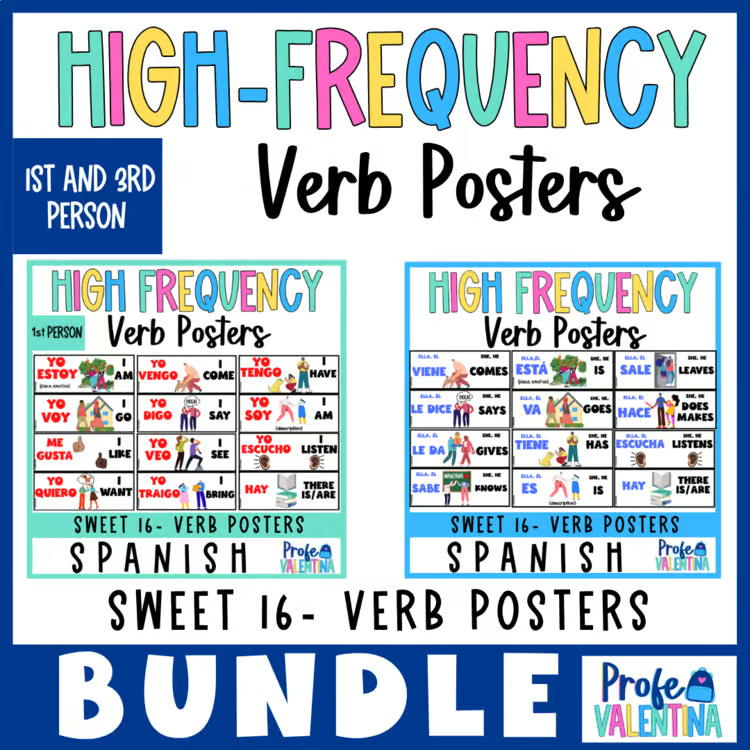
So I created my own reusable Sweet 16 in Spanish – High Frequency Words cards and added illustrations and consistent gestures.
Over the years, I’ve continued adapting the system for the way I teach: illustrated cards, consistent gestures, movable displays, and intentional recycling of these words throughout my stories.
Why red and blue?
All of my high-frequency words, plus a few additional words we use frequently, follow the same color distinction.
RED = when students talk about themselves
BLUE = when we talk about someone else
For example:


Why red and blue? Why these two colors? Honestly, I simply picked them.
I needed two colors that were easy to distinguish and that I could use consistently, so I chose red and blue. There isn’t a special meaning behind the colors themselves.
What matters is the consistency.
My students learn that red is always connected to talking about themselves (1st person) and blue to talking about someone else. (3rd person).
The color becomes one more clue. Instead of stopping to explain grammar, students can begin noticing the pattern naturally as they see and hear the language again and again.
And because these are high-frequency words, they’re words students can actually use to communicate, to talk about what they want, have, see, like, can do, where they go, and much more.
I add the words as we need them
I don’t put every card on the wall at the beginning of the year, I add the words when we actually begin using them.
When a word becomes part of our stories or conversations, we establish its meaning, learn the gesture, and then I add the card.
That’s also why I originally put magnets on the back of the cards. I wanted to be able to easily add new words, move them around, reorganize them, or take them down depending on the language we were using.
This year, I made it even easier and printed the cards directly on magnetic paper. Now I can move them around whenever I need to, and the display can continue to grow and change along with the language we’re using. The display grows and changes along with the language we’re actually using.
I don’t want a wall filled with words my students haven’t encountered yet. I want it to be a resource we actually use.
Every word has a gesture
Every high-frequency word also has a consistent gesture.
I use the same gesture for first and third person. The only difference is that when we’re using the first person, I point to myself first.
For example:
QUIERO → point to myself + gesture
QUIERE → same gesture
The gesture reinforces what the word means, while pointing to myself helps students recognize who we’re talking about.
I don’t want students memorizing two completely different gestures for words that communicate the same idea.
It’s a simple distinction, but it gives students one more clue while they’re processing Spanish.
Why did I add illustrations?
This was especially important to me because of the students I teach.
My students are young and/or novice learners. Some are beginning readers. Some aren’t reading yet. And some are completely new to Spanish.
So I don’t want the written word, or its English translation—to be the only way students can access meaning.
That’s why every high-frequency word card has an illustration.
The visuals help students:
- Connect the word to its meaning.
- Remember the word.
- Access meaning more independently.
- Participate even if they aren’t reading yet.
The illustration isn’t there to teach the word by itself. It’s another clue students can use as they listen, interact, and make sense of Spanish.
I intentionally add these words to my stories
This may be the most important part of the whole system.
The cards alone aren’t going to lead to language acquisition.
Students need opportunities to hear and understand these words again and again in meaningful contexts.
That’s why when I create stories for Aventuras in Learning, I intentionally look for natural opportunities to include and recycle the high-frequency words.
A student may encounter quiere in one story with one character and then hear quiere again in a completely different story.
Then they encounter it again, and again.


The characters, settings, and situations change, but the useful language keeps coming back.
That repetition is intentional.
When I’m creating a new story, I’m always thinking about the language students have already encountered and looking for natural opportunities to bring it back.
I don’t want students to memorize an isolated list of verbs. I want them to hear the words, see them, gesture them, understand them in context, and encounter them again and again.
Over time, the language becomes more familiar, giving students more opportunities to acquire it and eventually use it themselves.
It all works together
That’s really what these cards are about.
Color helps students recognize who we’re talking about.
Visuals help connect the word to its meaning.
Gestures reinforce meaning.
Pointing helps distinguish when we’re talking about ourselves.
The movable word wall grows with the language we’re actually using.
Stories intentionally recycle the language in meaningful contexts.
None of these supports has to do all the work.
A student might need the illustration today. Another may recognize the gesture. Someone else may notice the color. And after hearing quiere again and again through different stories, eventually they may not need any of those supports.
That’s the goal.
I don’t want my students to memorize my posters.
I want the posters to support them while they’re understanding and acquiring Spanish until those words become language they can use to communicate.
Want to use these in your classroom?
If you’re an Aventuras in Learning teacher, these High-Frequency Word Posters are already included with your membership.
My recommendation is simple: don’t put them all up at once.
Introduce the words as you need them. Establish meaning. Add the gesture. Put the card on the wall. Refer to it during your stories. And, most importantly, keep recycling that language.
Let the wall grow along with your students.
If you’re not an Aventuras teacher, the High-Frequency Word Posters are also available to purchase separately.
Because these cards aren’t meant to be decorations.
They’re tools to help students see, hear, understand, acquire, and eventually use Spanish to communicate.
Resources available in my store:
Looking for an Elementary Spanish Curriculum?
Try Aventuras in Learning for free! Explore 3 complete story units with videos, games, printables, and teaching resources to see how easy story-based language learning can be.
Create a free account and explore 3 complete stories, one from each level—at no cost!


Leave a Reply